Spring weddings in the UK come with a specific kind of charm. There's something about the way light stretches in gently, how gardens slowly wake up again, and how colours begin to soften across the landscape. It’s often during this season that couples turn toward simpler, more relaxed ideas that still hold meaning. That includes small touches that seem easy to overlook, like wedding menu signs.
When done well, these signs play a role that’s both practical and decorative. They help guests settle in, understand what's coming next, and enjoy the meal without needing to ask. Beyond that, wedding menu signs contribute to the overall look of the reception. They can soften the space, echo other elements of the decor, and reflect the season in their colour or detail. Spring brings its own cues, fresh florals, early greens, and lighter meals, and signs that pick up on those themes can naturally tie everything together.
Choosing a Style That Matches Your Reception Space
The style of your wedding menu signs should feel in step with the rest of your day. If you're holding your reception in a garden, for example, a design with floral edging, loose fonts, or subtle watercolour touches might work well. If you're in a village hall, clean lines and a more structured format could suit better.
Spring weather adds its own character. The way light filters into a marquee or bounces off a barn’s wooden interior can change how colours appear in person compared to when you first saw them indoors. Soft pastels might feel warmer under natural light, while bolder shades can stand out too much if not balanced.
It helps when signage design lines up with your overall stationery, menus, place cards, or welcome signs. This isn't about everything matching perfectly but about how it feels as a whole. Repeating a style element here and there, like a leaf pattern or the same lettering style, can gently hold things together without looking staged.
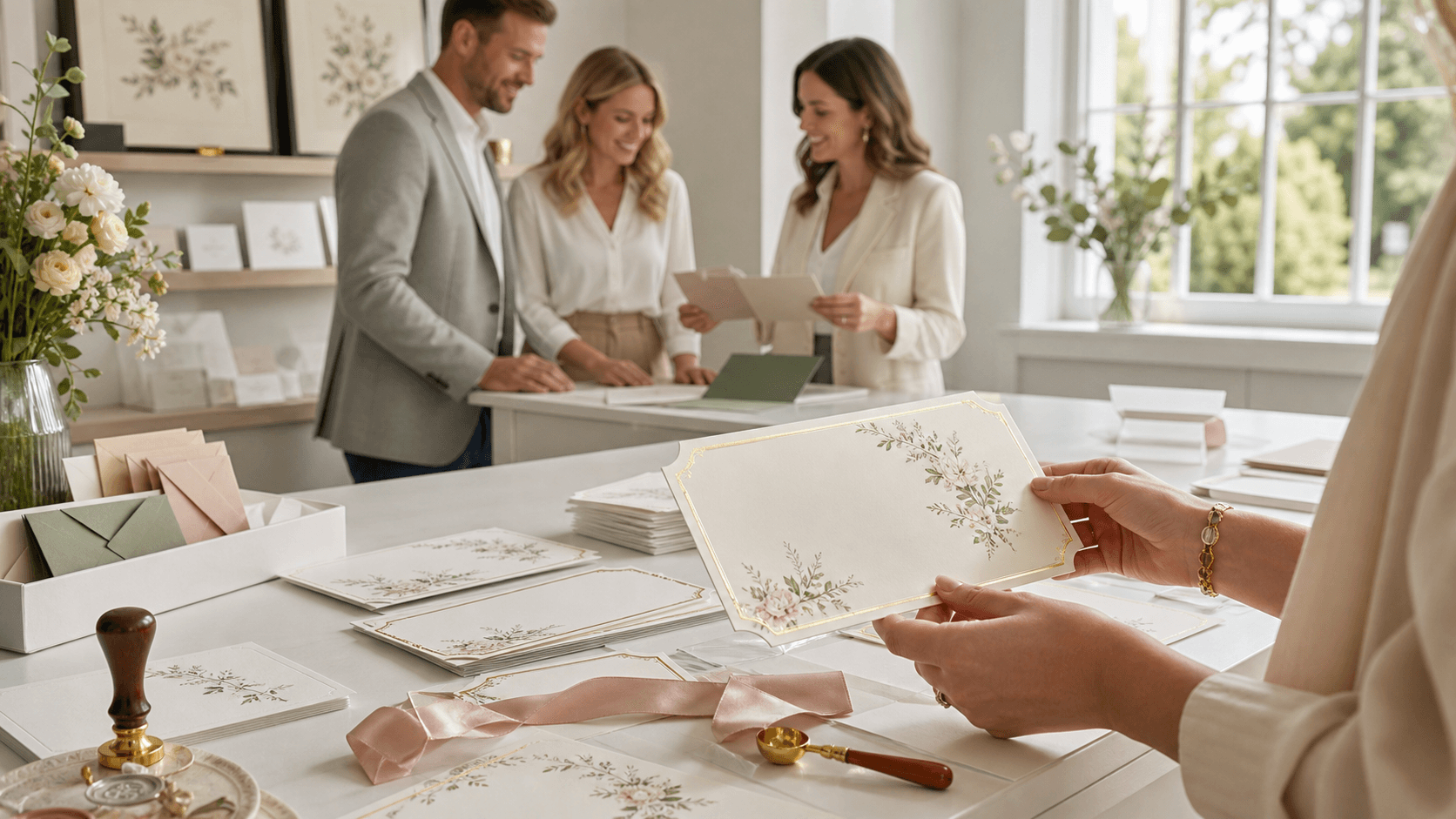
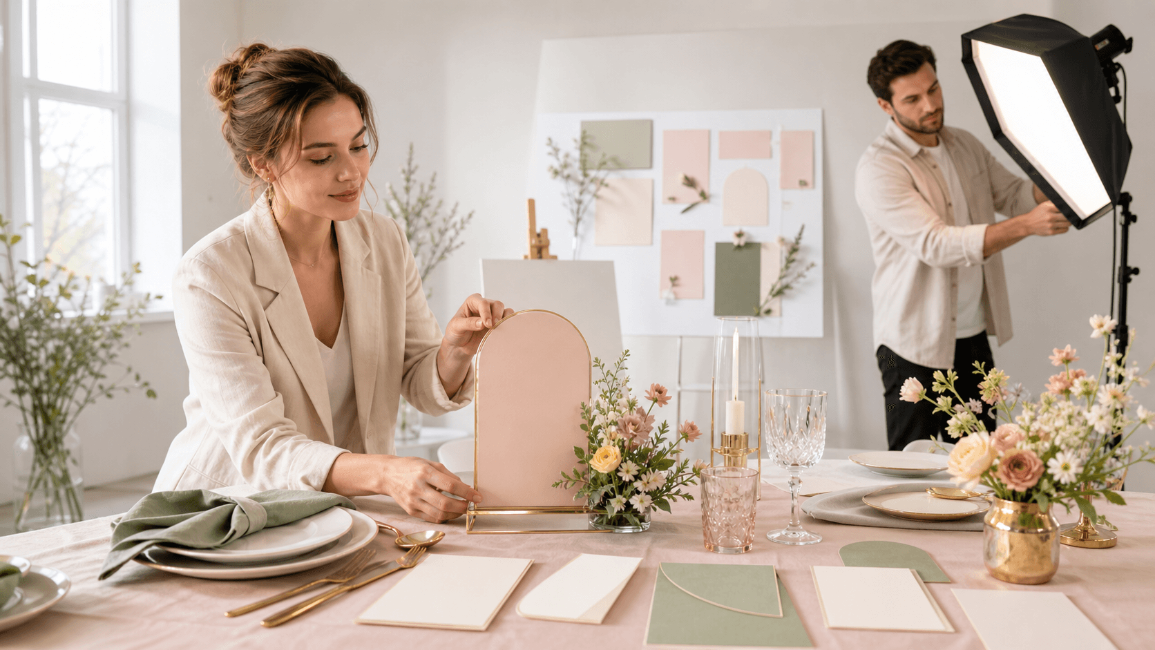
At The Invite Shack, we design wedding menu signs in a range of formats and sizes, making it easy to create signage that matches everything from single sheet invites to coordinated table plans and place cards for a consistent look across your event.
Making the Menu Easy to Read and Guest-Friendly
As lovely as a wedding menu sign may look, it still needs to be read. If guests can’t make out the writing from where they're seated or standing, the design has missed its mark. Easy readability makes for a better guest experience, especially during spring receptions when people may be moving between indoor and outdoor spaces.
Here are a few ways to keep your signs clear and helpful:
- Stick to fonts that have enough space between the letters and aren't too thin
- Make the text large enough that it can be read from a metre or two away
- Keep the content clean, list out courses in order, add clear section breaks, and avoid over-explaining
If you're including information about allergens or dietary notes, keep it gently highlighted but not dominating. A small symbol or label next to certain items works better than a long explanation, especially if the sign is already holding multiple text lines.
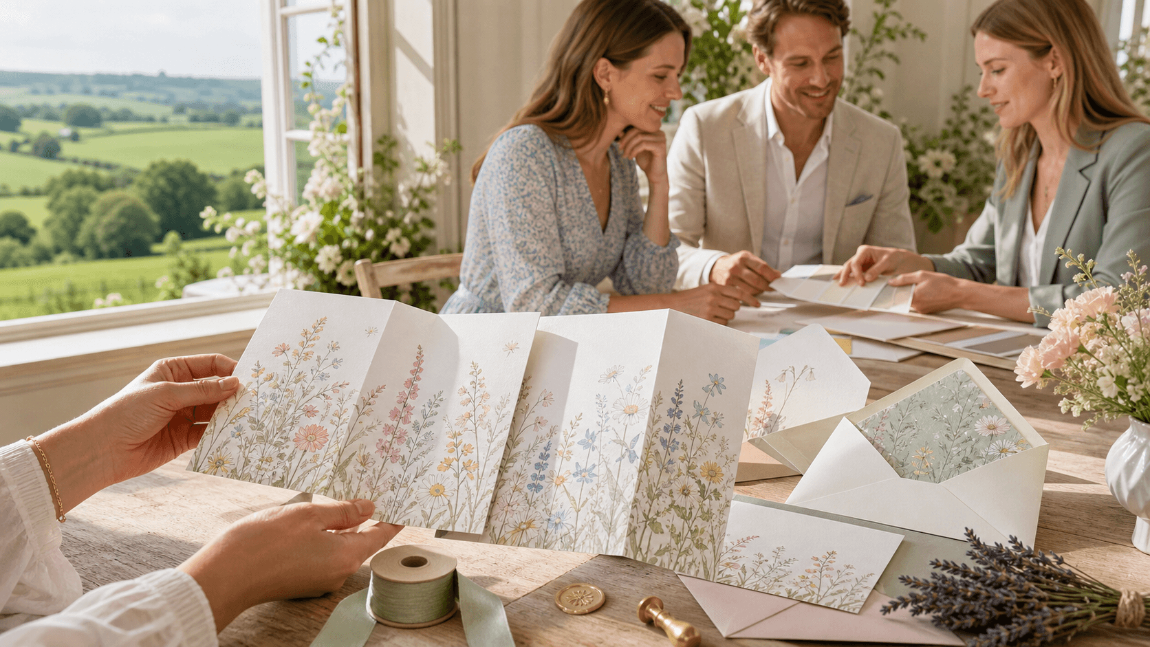
Spring Themes to Inspire Your Menu Sign Design
Springtime often brings a particular softness and sense of freshness to weddings, and that can be reflected in your wedding menu signs too. Think of your sign not as a standalone object but as one part of a bigger visual setting.
Here are a few ways to let spring inspire your design:
- Use soft colours like apple green, blush, powder blue, or muted peach for a gentle seasonal nod
- Include border touches like small blossom clusters, greenery, or illustrated vines
- Reflect other elements from your day, such as repeating flower types from centrepieces or echoing bridesmaid dress shades
It doesn’t all need to be pastel-driven either. Some couples go for more citrus-inspired palettes or deeper garden tones. The real key is choosing colours and motifs that feel natural for your day, not ones that only suit a theme.
Placement Tips for Better Guest Flow
Where you put your menu signs can quietly affect how smoothly the reception flows. If guests glance around trying to figure out what’s being served, or if they have to move around too much just to read it, the moment gets interrupted. A good sign placement answers questions before they're asked.
You might try:
- Placing larger signs near the dining entrance so guests can see the meal at a glance
- Putting smaller signs directly at the buffet or food station, especially for informal service
- Choosing sturdy frames that work on soft outdoor surfaces or uneven grass patches
Think about how people will move. It’s useful to stand in the space ahead of time and follow the path your guests will take. If they naturally walk past a certain corner before finding their seat, that's a good place for a sign to gently catch their attention without needing to call it out.
Materials and Layout That Handle Spring Weather
Given how unpredictable spring can be in the UK, it’s smart to plan for changing conditions. A calm, light-filled morning can give way to unexpected clouds or wind. The design and structure of your menu signs should plan quietly for this, less so out of fear but simply to keep things steady.
Here are some approaches that work well:
- Use a layout that gives structure and weight to the sign, so it doesn’t tip over in a breeze
- Consider surface treatments or mounts that won’t be affected by a bit of drizzle
- Place signs somewhere protected if your day includes open garden areas, such as under a tree canopy
It's small choices like these that make a difference to how remembered and respected the details feel. Your guests will feel considered without ever needing to think about it.
Designing Meaningful Details Without Overcomplicating It
Even something as simple as a printed meal list can hold meaning. The key is finding a way to add personal touches that don’t overcomplicate the layout. Subtle details carry a lot of weight, especially when they come from a place of sincerity.
Thoughtful touches can include:
- Adding a short caption like “A few of our favourites” or “Home-style comfort, made with care”
- Using dish names that quietly reference shared memories, such as a pasta from a holiday spot or a dessert you once made together
- Including a quiet thank-you note at the bottom of the sign for the guests who supported you along the way
The goal here is not to explain everything but to let the meals feel like part of your story. If kept short and spaced out well, these elements won't make the design feel crowded or confusing.
Let the Menu Sign Reflect Your Wedding Story
There’s something reassuring about walking into a celebration where even the meal signs feel considered. It helps people settle in. Soft lighting, a familiar meal, and a design that matches the day’s mood all contribute to the feeling that the day is unfolding in a natural and thoughtful way.
Spring weddings in the UK already feel gentle on their own, the colours, the air, the beginning of new growth. Wedding menu signs simply help underline that, showing your guests that you’ve thought about their comfort along with your own joy. And when the food and signage tie in with the rest of your day, the celebration feels like one seamless whole rather than a pile of parts. Small details, kindly made, go a long way.
Planning a spring wedding means every detail should reflect the season, and your signage deserves the same thoughtful approach as the rest of your celebration. We design with clarity, ease, and balance so nothing feels out of place, especially during your meal. Our styles pair beautifully with fresh florals, muted colours, and laid-back gatherings where guests feel quietly cared for. For more ideas and inspiration, explore our wedding menu signs to find the perfect fit for your setting. When you’re ready to create something bespoke, contact us at The Invite Shack.