Introduction
Early summer in the UK has a gentle kind of energy. The skies open up, the light stays longer, and everything feels just a little easier. It's a lovely time of year to get married, with many couples planning ceremonies in gardens, on coastlines, or in countryside barns.
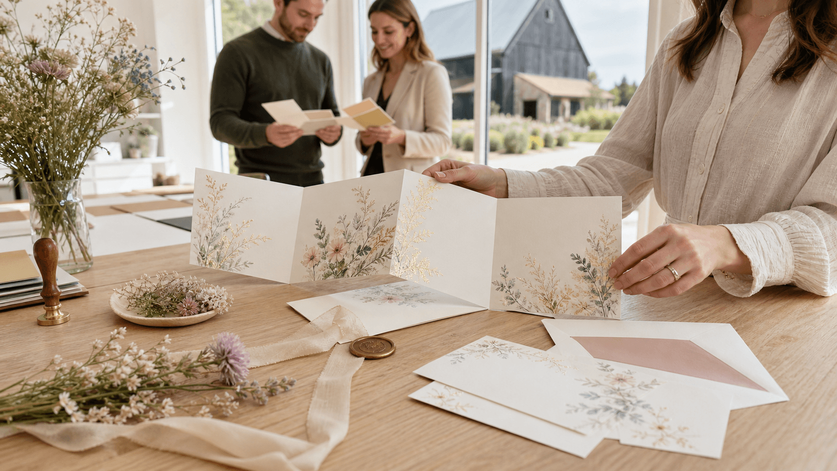
When choosing wedding card designs for this season, a soft touch goes a long way. Invitations carry the first glimpse of a couple's plans, and their tone can do more than just share dates. They help set the mood, give a sense of style, and keep everything tied to the setting and time of year. That's why design choices matter, especially in early summer when certain colours, formats, and details feel more fitting than others.
Light Colours and Seasonal Shades
The warmth of early summer calls for colour palettes that feel fresh and open. It's the season when nature leans into greens, soft blues, and subtle florals, and those cues can inspire your invitation design too.
- Soft pastels like lavender, blush, and sky blue often feel right for early summer
- Shades that pick up natural surroundings (like sand near the coast or leafy tones from a garden) help connect your invite to your venue
- Try to steer clear of moody or wintry tones, as they can feel weighed down, think charcoal or deep burgundy, which are better suited to colder months
What we've seen work well are hues that feel friendly but not loud. Creams paired with sage, or a faded rose with off-white touches, are gently warm without being overbearing. Pale yellow or muted coral can be lovely too, especially for daytime weddings outside.
Simple Details That Feel Fresh
Warmer months don't call for fussy designs. Early summer works best with wedding card details that feel light to the eye and to the touch. That doesn't mean plain, but it does mean knowing where to pause.
- Clean lines help the design breathe, especially if the invite is printed on a light background
- Subtle floral accents or hand-drawn corners can call back to gardens or park settings without becoming the centrepiece
- Light embossing or soft outlines often feel more in season than bold borders or full-cover illustrations
It's often better to let one or two features stand out, rather than trying to include everything. A quiet background sketch or a small set of florals nods to the season without making the invite feel overly themed.
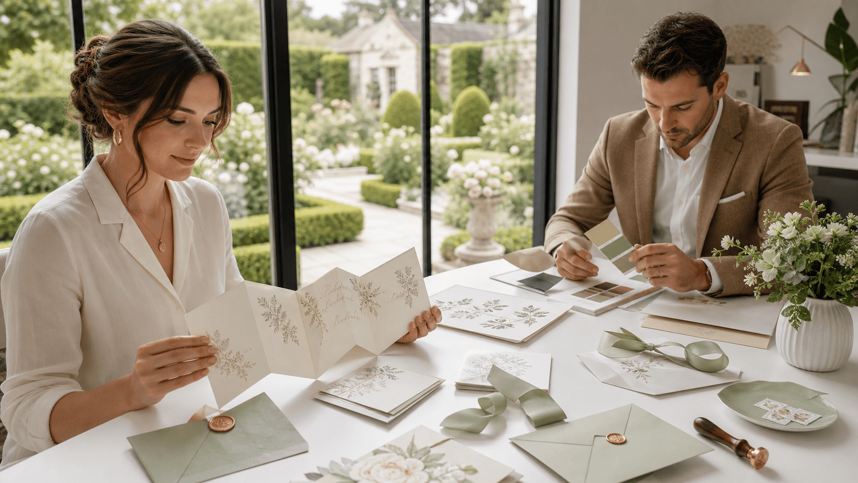
Formats That Work for the Weather
Early summer brings relatively dry and stable weather in much of the UK, which means there's less worry about humidity or handling. Because of this, both folded and flat-layer formats work well, and it's more a question of preference and tone.
- Single-card formats are great for more relaxed or beachside weddings, and they post well too
- Folded cards work best when there's a bit more detail to include like ceremony timings or directions
- Keep layers and inserts to a minimum, or use them in a way that adds order rather than clutter
Lightweight invitations are ideal. They stay neat through the post and don't feel out of place on a warm sunny afternoon. If you're choosing a design, go for straightforward structures that open easily and hold their shape.
At The Invite Shack, our single sheet invites are designed for ease and elegance, working perfectly with May dates and early summer colour palettes. Each invitation set can be customised with matching RSVP, menu, and detail cards for a seamless guest experience.
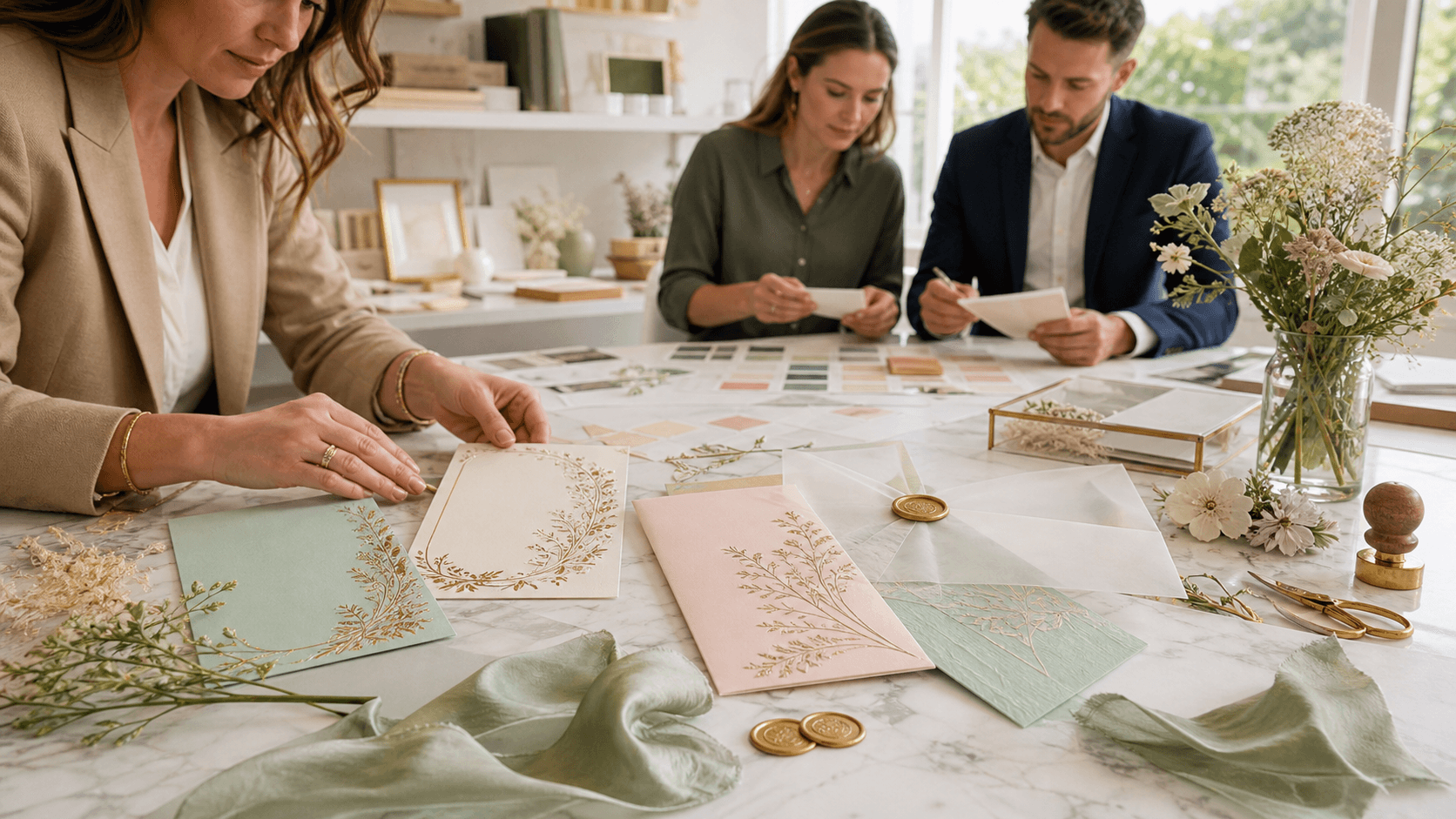
Designs That Match Summertime Venues
The wedding location often shapes how an invitation feels. While you may not want to go heavy on the theme, it helps to keep the setting in mind when choosing colours, layout, and tone. The connection between your invite and venue doesn't need to be loud to be effective.
- For countryside barn weddings, earthy tones with simple line sketches can bring that relaxed, rural feeling
- Garden marquees feel right with floral illustrations or a soft palette drawn from nature
- Coastal venues go well with pale blue, cream, or washed-down sea tones
- Registry offices or more traditional spaces may suit a neater layout with just one or two subtle flourishes
Keep in sync with the location, but avoid overdoing it. For example, a small coastal detail like a wave pattern along the bottom is enough, it doesn't all need to be shells and anchors. Letting the venue guide the mood of the card helps guests picture the day without overwhelming them.
Personal Touches That Make Guests Smile
Adding small pieces of your own story keeps wedding invitations from feeling generic. Early summer allows room for warmth in language and decoration, so personalised elements fit especially well now.
- A hand-drawn sketch of the venue or the couple themselves adds something memorable
- Dates or song lyrics tucked into a corner offer a quiet nod to your story
- Phrasing in the invite can stay light and cheerful, asking guests to celebrate with you rather than using formal lines
The personal touches don't have to take over the design. A little bit goes a long way. If the rest of the invitation is thoughtfully simple, then one or two meaningful elements will stand out and be remembered.
You can also think about how the details in your wording connect to the season and setting. For May or early June weddings, consider using short greetings or playful language that invites guests to relax and enjoy. This invites a friendly tone and sets up the day as something warm and inclusive rather than stiff or overly formal.
Personalising isn't only about visuals. Consider adding a special note just for the people you're inviting. It doesn't have to be long. A line or two, such as 'We can't wait to share this day in the garden,' makes the message memorable and helps guests feel like part of the experience right away. Early summer's atmosphere is naturally light, so reflect that mood in your design and writing.
A Confident Start to a Bright Wedding Season
Early summer weddings often carry a sense of optimism. The days are longer, the air is softer, and plans begin to feel real. The right wedding card designs help carry that feeling forward.
When invitations match the season, venue, and mood of the couple, they don't just tick off a planning task. They create connection. They help guests feel part of what's coming. With just the right balance between style and story, summer wedding cards become more than a notice, they become a keepsake of a season that's ready to begin.
Explore the formats we've highlighted to find inspiration for your own invitations this season. For warmer months, our collection of wedding card designs is easy to post, simple to handle and perfect for early summer celebrations, leaving plenty of room for personal touches without overwhelming your details. At The Invite Shack, we're here to help you create something that feels just right for your day, so reach out when you're ready to get started.