Avoid Concertina Invite Stress From the Very Start
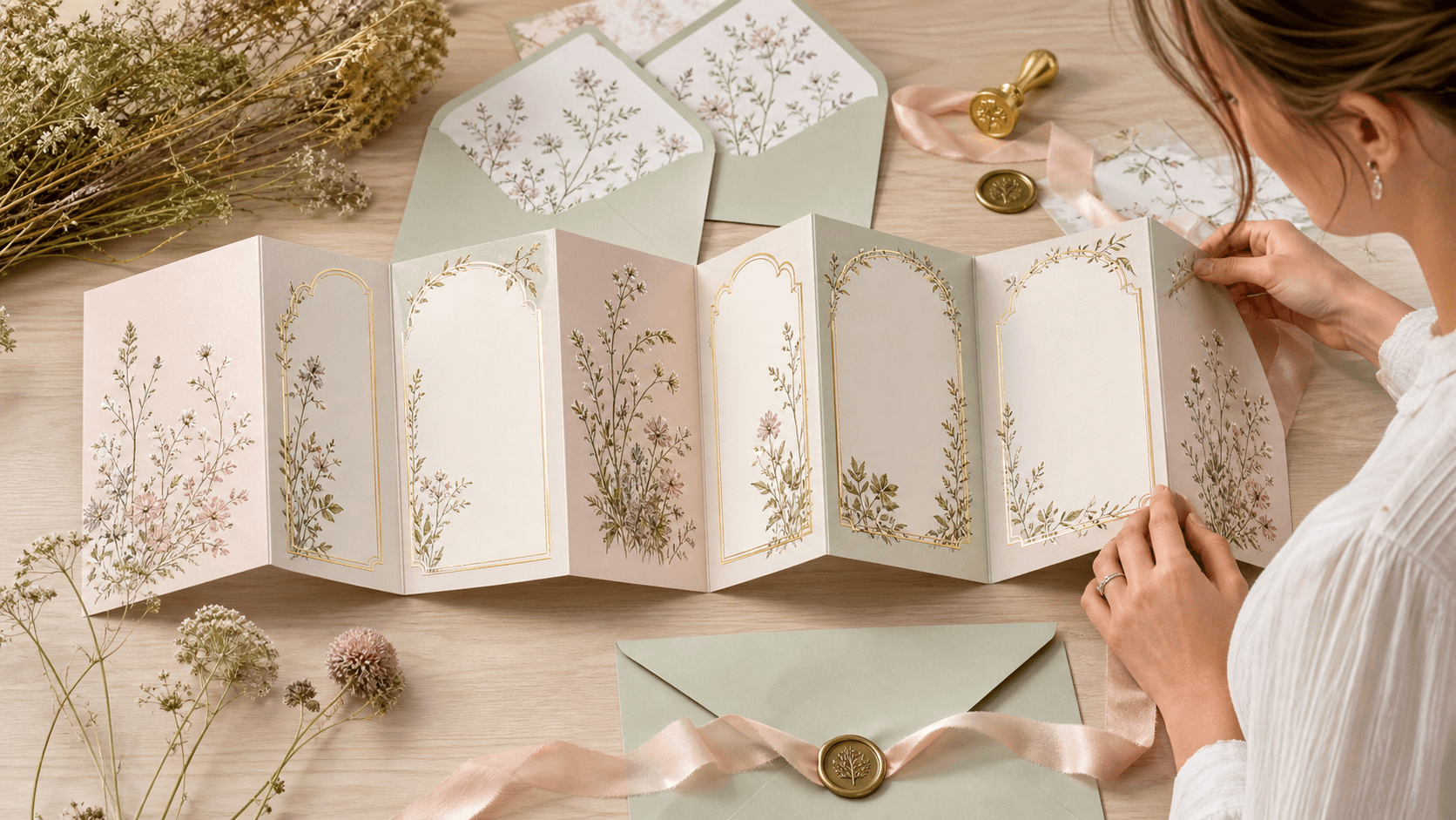
Concertina wedding invites in Kent are having a real moment. Couples love that fold-out feel, the way you can tell the story of the day step by step, and the little gasp guests give when they open it up. It feels special, like opening a tiny keepsake of the wedding.
But that lovely format can go wrong quite quickly if it is not planned with care. Panels can end up misaligned, details can be hard to read, and the invite can feel disconnected from the rest of your stationery. When you are planning a spring or summer wedding and sorting stationery in October, you want everything to feel calm and under control, not stressful and rushed.
So we are going to walk through the most common mistakes couples make with concertina formats for UK and Kent weddings, and how to avoid them. With a bit of thought at the start, your concertina invite can look polished, read clearly, and tie in with every other piece of paper on the day.
Overloading the Panels and Confusing Your Guests
One of the biggest problems with concertina invites is the simple thought of, "Great, more space, let us put everything on here." It is tempting to cram in timings, travel, parking notes, gift info, menu ideas and hotel lists on every fold.
That is when guests feel lost. They do not know where to look first, and the key details get lost in the noise. White space is your friend with this format.
We like to think about content in clear layers:
- Front panel: names, clear date and a simple headline detail
- Main inside panel: ceremony time, venue, and any reception wording
- Extra panels: travel highlights, RSVP info and a short note on gifts or dress code
Anything beyond that, like:
- Long lists of hotels
- Full step-by-step driving directions
- Detailed gift explanations
- Big chunks of small print
works far better on your wedding website or a separate insert.
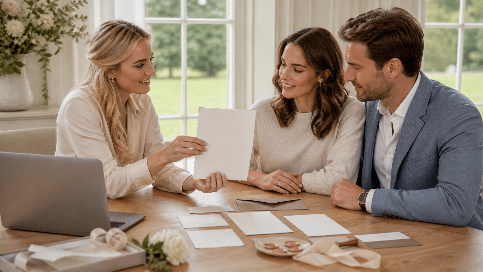
At our studio we guide couples through which details truly need to be on the invite and which can be moved elsewhere. We help break content into neat, focused sections so each panel has one main job. That way, when guests open the invite, their eyes move calmly from the key facts to the helpful extras, not into a wall of tiny text.
Ignoring How Concertina Invites Fold and Read
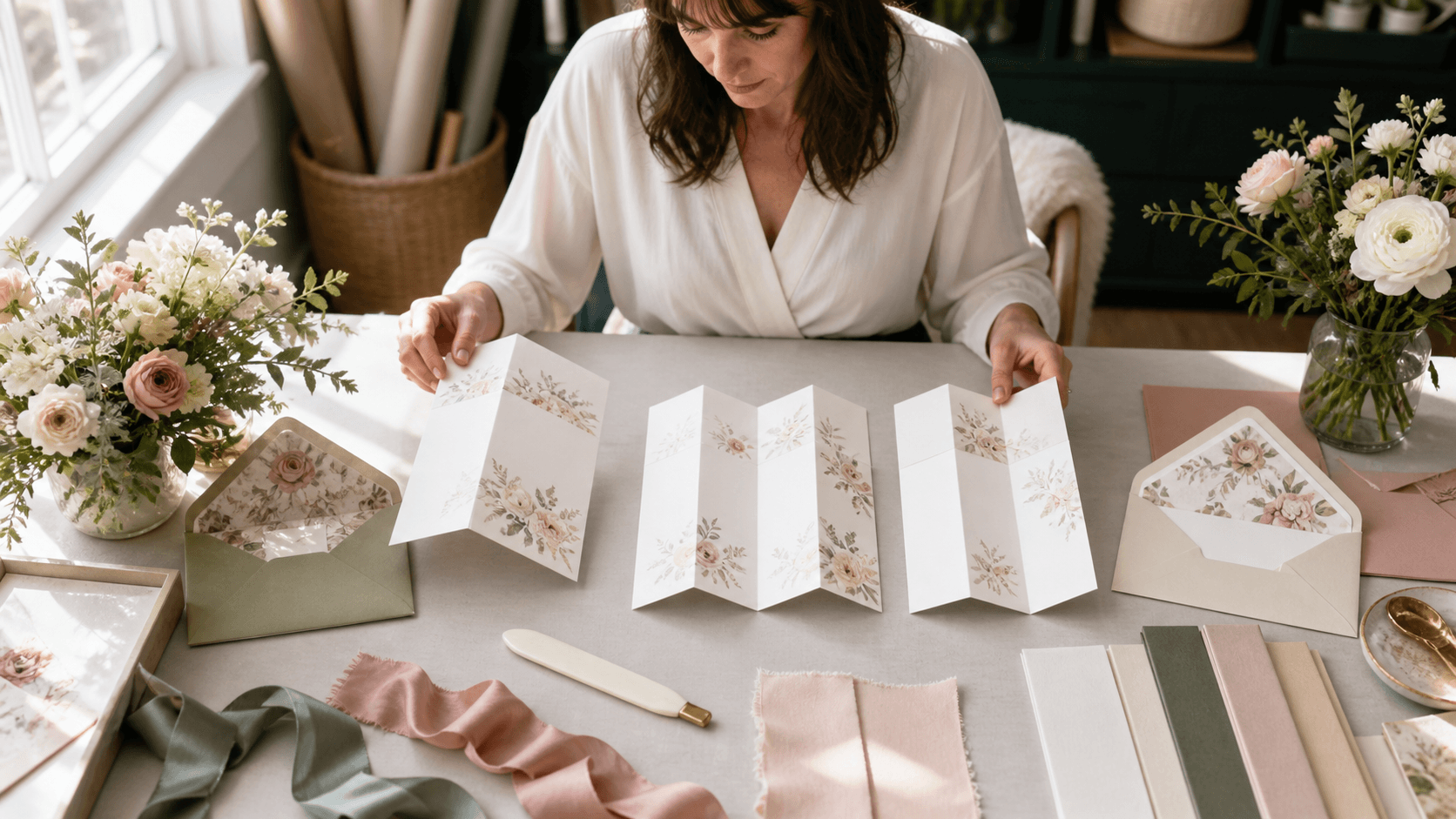
Concertina wedding invites are not flat cards, and they should not be designed as if they are. The way they fold, flip and refold really matters. Guests will open the first panel, then unfold, sometimes turning the card as they read. If the order of information does not follow that natural movement, things quickly feel muddled.
Common layout mistakes include:
- Important wording sitting in the crease, so it is hard to read
- Panels that read in the wrong order once unfolded
- Text or artwork too close to the trim line, risking a cut-off look
We always think about the "reading path". You want guests to see on one smooth flow:
- Who is getting married
- When and where
- What time to arrive
- Extra info like travel and RSVP
Professional templates and proofs help make sure the design works both fully open and partly folded on a fridge door. We keep all text inside safe zones, away from creases and cut lines, so nothing important disappears in the fold. The end result is an invite that feels natural to handle and simple to follow, even for older guests who may not love fussy layouts.
Forgetting Kent-Specific Travel and Venue Details
Kent is full of beautiful but sometimes tricky places to reach. From farm venues down narrow lanes, to coastal barns with limited parking, to grand historic houses tucked behind tall hedges, guests do not always find things as easily as they hope.
Two opposite mistakes often happen on concertina invites:
- Trying to give every possible route, so you end up with huge blocks of tiny text or a very cramped map
- Giving almost nothing, just a postcode, which leaves guests guessing about parking or travel time
A better middle ground is to keep one panel focused on "getting there". That might include:
- Short, clear notes for drivers, like nearest main road or a key landmark
- A quick parking note, such as on-site or nearby public car park
- A hint on public transport, for example nearest station or main bus route
- A short web link or QR code for full directions and hotel lists
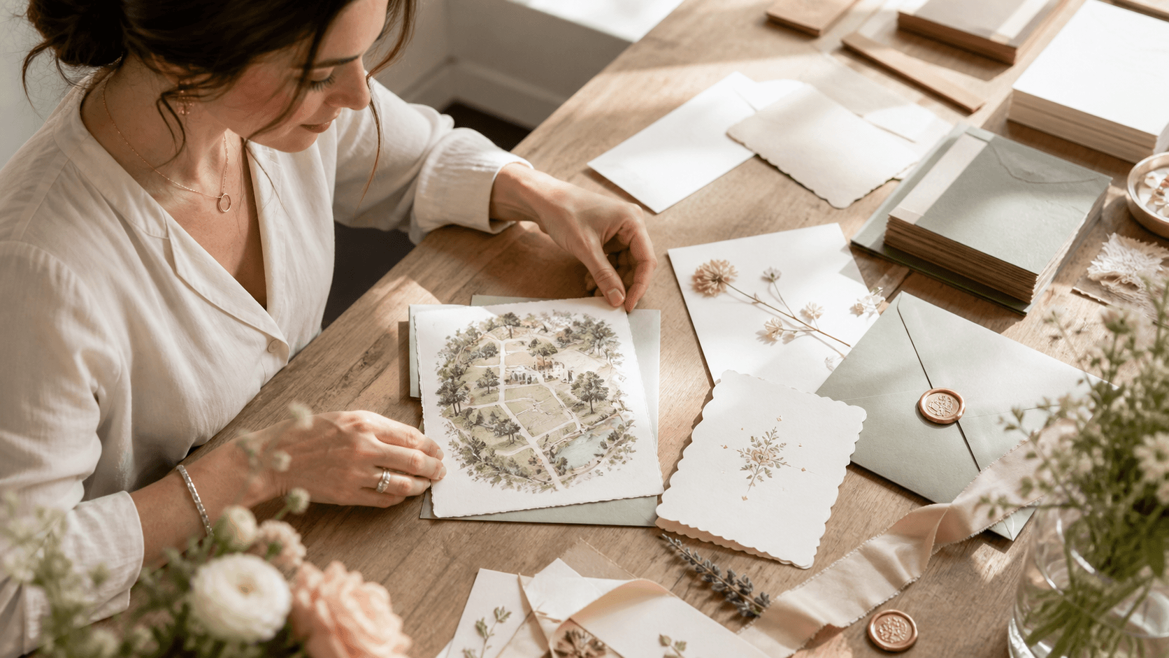
If you love illustrated details, a simple little map can be lovely, but it should support the words, not compete with them. Clean, bold icons and a few key road names will be far more helpful than a busy sketch of the whole area. We often keep Kent map panels light and open so guests can see at a glance how to approach the venue, then use the digital link for deeper detail.
Choosing Styles That Clash with Your Wedding Story
It is very easy to fall for a concertina invite just because the artwork is pretty. But the design should sit comfortably with your venue, season and the rest of your stationery. When those elements clash, the whole wedding story feels a bit disjointed.
Some style clashes we see often are:
- A loud festival style invite for a very formal manor house celebration
- Soft pastel watercolour paired with a sharp, modern, industrial venue
- Rustic field and barn artwork for a chic city style reception
The key is to think of your stationery as one long thread from save-the-date to thank you card. Colours, fonts and illustration style should play nicely together. If you know you will want welcome signs, table plans and place cards to match, it helps to choose a concertina design that can stretch across those pieces.
We work with cohesive collections and flexible elements so couples can tweak colours, swap motifs and adjust layouts. That way, the concertina invite becomes the starting point for a full suite that fits the venue, season, and general feel of the day, rather than a one-off that looks out of place in photos.
Skipping Professional Proofing and Going It Alone
Because concertina invites look simple at first glance, couples sometimes feel they can rush the text or quickly order online without proper checks. That is when small errors creep in and only show up once everything is printed.
Typical problems include:
- Typos in names or place names
- Wrong ceremony or coach collection times
- Misaligned folds that cut through important wording
- Mix of UK and non-UK spelling that feels untidy
For Kent weddings, things like accurate local place names, clear address formats and correct use of UK spellings really matter. A second pair of expert eyes often spots little slips that you will not notice after staring at the same wording for days.
In our studio, every concertina design goes through digital previews and feedback stages. We help refine phrasing, check the flow, and make sure all details read smoothly from panel to panel. That extra care means the invitations you send out feel calm, polished and ready for guests to pin proudly to their boards.
Bring Your Wedding Vision To Life With Beautiful, Personalised Invites
If you are ready to set the tone for your day, explore our carefully designed concertina wedding invites in Kent and choose a style that feels truly like you. At The Invite Shack, we work closely with you to refine wording, colours and finishing touches so your stationery feels cohesive and considered. Share your ideas or special requests and we will guide you through each step, from first proof to final print. If you are unsure where to begin, simply contact us and we will help you get started.